Final Racing Bar Chart
Final Timeline:
Finding A Story
In this Factoid story, I propose to write a story about the number of COVID-19 cases by county in Maine. The data provided includes information on each individual death from COVID-19 in Maine, including the county, age, gender and date.
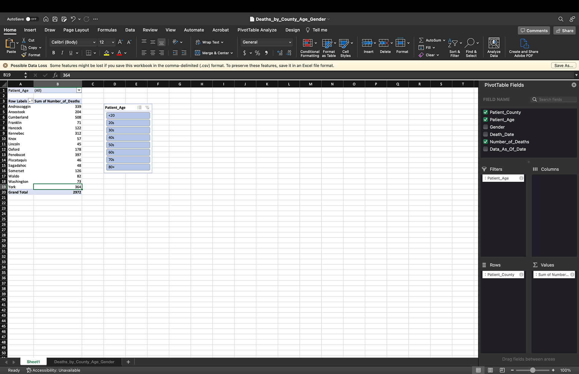
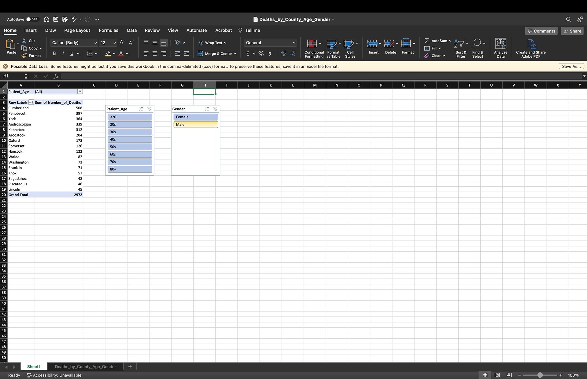
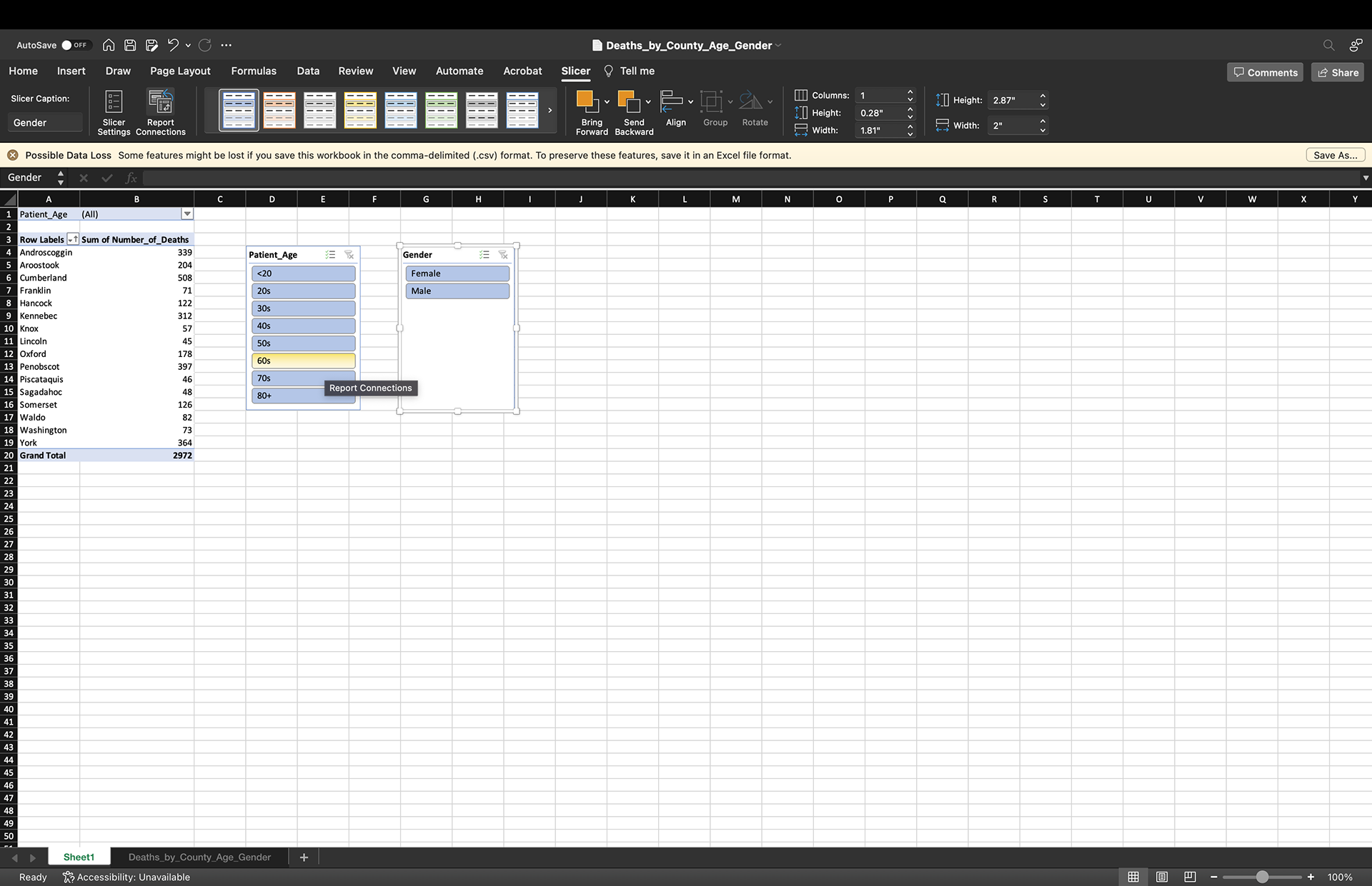
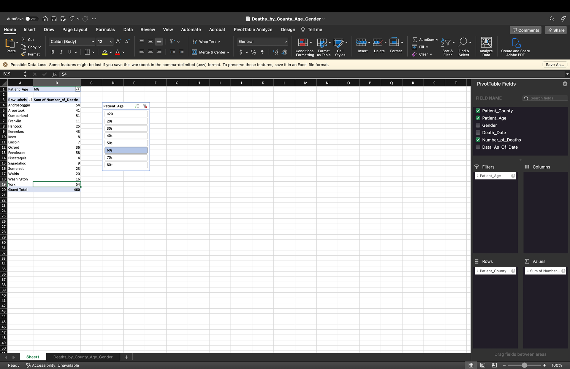
Using a pivot table I analyzed the collected data by the Maine CDC on deaths caused by the virus, creating a sum of deaths per county. The data also included the age and gender of each death, so I created slicers to filter the data by age and gender.
With no filters, the country with the largest number of COVID-19 deaths is Cumberland Country at 508. Cumberland County to no surprise is the largest populated county in Maine, and by filter has the highest number of deaths the majority of the time. For example, the highest number of deaths of males over the age of 80 is 105 in Cumberland County.
Using this data I created a pivot chart to visualize the number of deaths per county into a bar chart. The bar chart is interactive with the slicers from the pivot table to visualize the deaths per county by age. Now I can click on an age or a gender to visualize on the bar chart how many deaths per county there are based on those parameters.
Looking at the COVID-19 deaths per county in Maine offers a chance to tell several stories. The overall story can be informing the public on this data, using the slicers to sort by age and gender adds another layer. There are still a lot of unknowns about the virus, but with a lot of misinformation out there about the virus and the deaths it is important to use data like this to inform the public of the factual data. The Maine CDC itself does a good job visualizing this on their own website, but with the ability to write a story that readers will be able to digest through writing and data visualization will make the information more accessible.
Another interesting story that could be taken from this data is to look at the average age per county to do a comparison story with this data. Because Maine has an older population, especially the further you get away from the southern part of the state, I think an important factor and consideration to take into account when looking at the number of deaths per county with a filter on age is an understanding of the average age of the county. For example, when looking at the number of deaths per county under the age of 20, only Cumberland, Franklin, Penobscot and Somerset counties appear with a grand total of five between them all.
Screenshots of Pivot Tables:
Data User Guide
The data user guide on Massachusetts Office of Travel & Tourism Annual Report
Open Refine Exercise
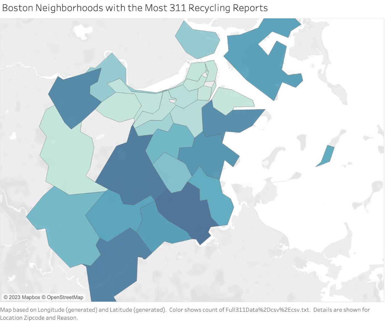
For this exercise, data was used from Analyze Boston's 311 Service Requests - 2022. Open Refine was used to clean and sort the data in order to be analyzed. The following questions were posed by the professor.
Which Boston neighborhood has the most 311 cases in 2022?
Dorchester
What is the most common subject Dorchester, Greater Mattapan, and South Boston Waterfront and Downtown?
Dorchester: Public Works Department
Mattapan: Public Works Department
South Boston Waterfront: Transportation - Traffic Division
Downtown: Public Works Department
Which month has the most and least cases (Hint: Transform the open_dt column, then Facet it by timeline):
Most: February & August (timeline is too small to see clearly)
Least: December
Choose one reason to clean the neighborhoods in Open Refine and visualize it in Tableau:
Show below
Coded Bias Response
The Coded Bias movie was a very interesting look into ways that people around the world are looking into artificial intelligence and its many faults. To start with my favorite part, I would have to choose when Joy Buolamwini testified in front of the United States Congress about their findings in artificial intelligence. This felt like a culmination of all of the work Buolamwini had done throughout the film, discovering that her face was unrecognizable by many popular and commercial artificial intelligence programs such as Amazon’s. In her research she realized that her face was then recognized by these programs when she put on a white mask, signifying that the programs only recognized white faces. This led her down a path of “heroism” creating the digital advocacy group, the Algorithmic Justice League.
Buolamwini also found that in an apartment complex there was a landlord that wanted to use facial recognition in their building. The film also took the problem worldwide, where in England the police were using facial recognition to make faceprints of millions of people. The film centered on Big Brother Watch, a program that opposes the way the police was using facial recognition in public places and looked to make the public aware of what was happening. One of the most compelling parts of the film was when they captured a moment of the police stopping a schoolboy in the street due to the facial recognition they found. They also stopped a man for wearing a hood over his head so he wouldn’t be scanned, bringing up the question of freedoms and rights around having your face scanned and documented by the police.
When it got to the point of testifying in the United States Congress, it felt that the work that Buolamwini and other activists against artificial intelligence were doing was actually making some traction. The government went on to ban facial recognition in the federal government, as proven by Buolamwini and other activists, it inherently infringes on the rights and freedoms of private citizens.
I think something that is missing in the story is a foundational background on when artificial intelligence came into the picture and why governments were already beginning to apply them in the police force. As I agree with the arguments being made, the fact that it told mainly one side of the story was okay with me from a documentary standpoint, but I think if there was to be a journalistic take on this story I would be interested in seeing interviews with the other side of the argument. Not because I agree with them, but because I think you can only strengthen and build upon your own argument by hearing what the other side has to say, allowing yourself to build a stronger and more substantive argument. This likely happened behind the scenes in the research, but I would like to see more of that in greater detail. Artificial intelligence is very flashy and a lot of people are drawn to the brand new form of technology, so I am curious as to why it is being applied so quickly without fully being drawn out to include facial recognition for every race, and why police are instantly using it to make faceprints of people.
As mentioned above there are many groups that are being marginalized in this are people of color, and in general everyone in the sense that governments such as the police in England were using facial recognition to make faceprints of everyone. But the fact that people of color were being inaccurately recognised by facial recognition causes a lot of extreme problems. Mentioning the ProPublica piece that we read about earlier in the semester, it was interesting to talk a little more in depth about that in the film from an outside perspective. How and why are these programs being used if they cannot correctly identify people of color, as well as mislabel them in the court?
In my own experience I have found that artificial intelligence seems to be very lacking. Not in the sense that I have experienced any encounters with not being recognised by it, but that the programs seem to be in a very early sense of development. I think that due to capitalism and the big industry push to always have the new technology before anyone else has brought artificial intelligence programs into the hands of consumers much earlier than it should have been. Artificial intelligence programs like ChatGPT are becoming increasingly popular in the use of consumers, but as illustrated in the recent New York Times article the artificial intelligence had a harrowing conversation with an opinion writer, and has shown a lacking understanding of information. This also can be illustrated in the past attempts of artificial intelligence chat programs, the most popular being Tay from Microsoft that ended up releasing a lot of racist tweets before being taken offline.
The movie is significant to the course because it illustrates how we as data journalists need to be wary of how the government is using thing such as artificial intelligence to infringe on people's freedoms, as well as looking into how big company’s are excluding races and genders in the new technology they release. The work done in this film is a great representation of how research was done into these topics that hadn’t fully been explored and led to the passing of legislation in the United States Government, and bringing awareness to the people in England as to how their government was using facial recognition. I think that as data journalists we should feel compelled to look into these stories and as journalism itself calls for, fight for democracy and the freedoms that are afforded to us.
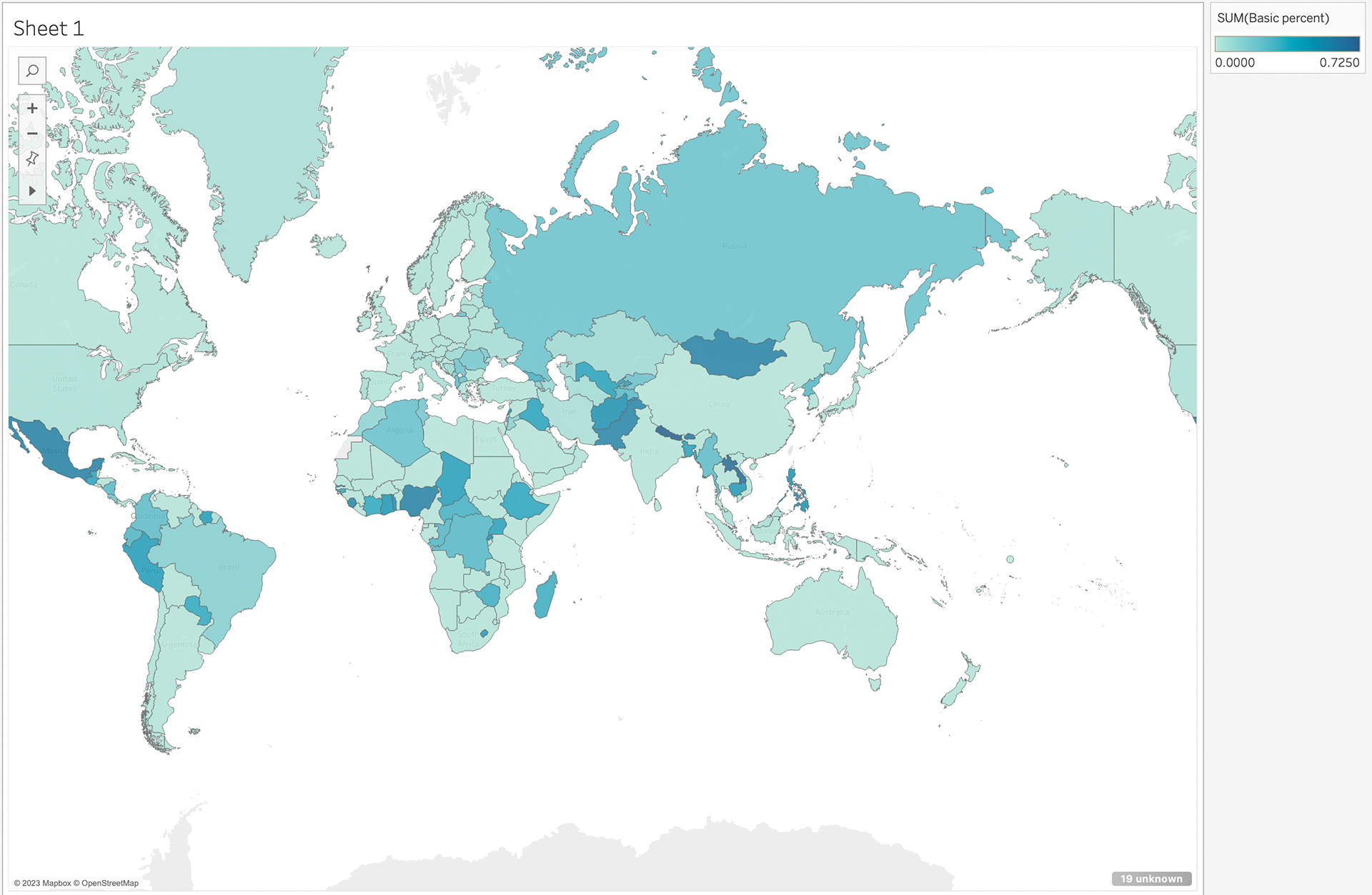
First Chart - Basic Water Percentage Access Throughout the World
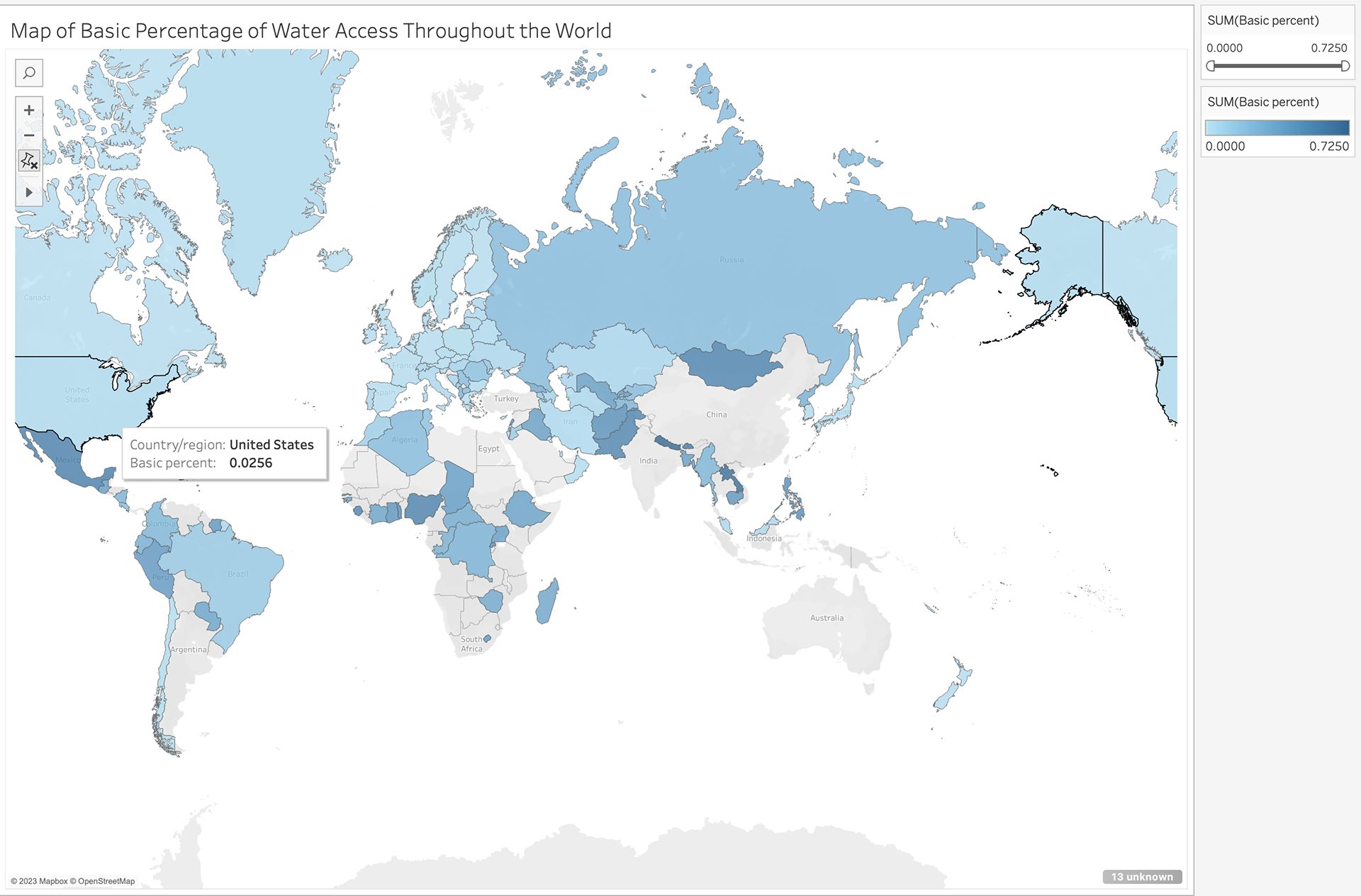
The process I took for this map of the Basic Water Percentage Access Throughout the World was beginning by importing the data into Tableau. From there I assessed what would make the most sense visually to contextualize the dataset. Considering it was showing data from each country, making a map seemed to make the most sense. I then brought in the basic percent data, and made sure to not include countries that had no data included, which would be the grey countries. I then set the data to appear visually by a darker tone of blue correlating to a higher number and a lighter tone of blue correlating to a lower number. The visualization allows the user to hover over the country and it will tell them the exact basic percent in each country.
Three questions that exploring the data visually provoked me to ask:
1. Why are some of the countries not included in the data set?
2. Why are the countries with the higher percentage of basic water access so scattered across the world?
3. If the dataset was completed would there be a drastic piece of data that stands out showing an extremely high or low percentage of basic water access?
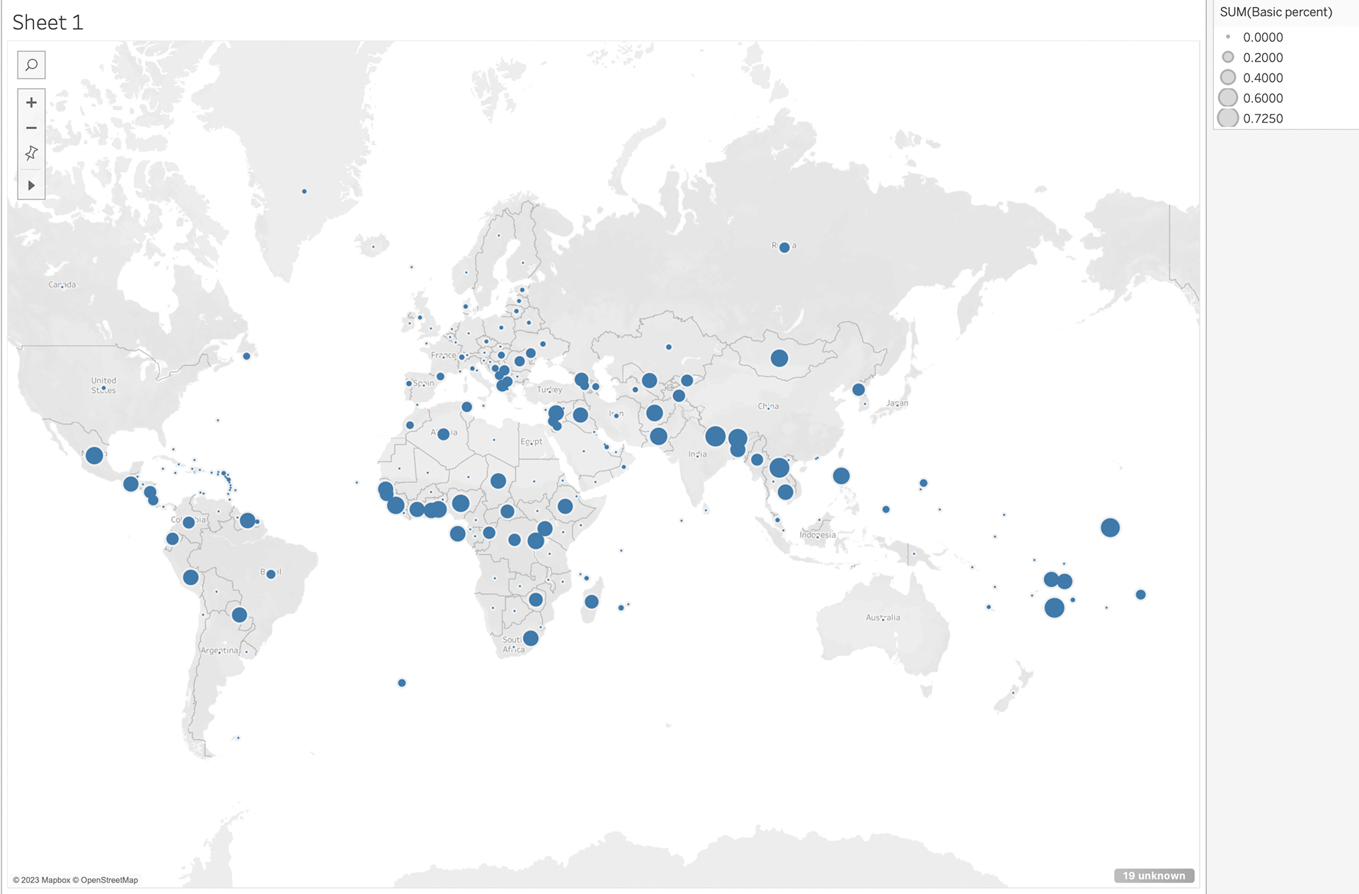
Below are two in-progress images during my work on the visualization:
The first image on the left is from when I created the map and brought the dataset in, as Tableau defaulted to circles to show the data.
The second image on the right is from when I changed the map to shade in the countries, but had no yet filtered out the null data in the map.
Examining Your First Data Set:
City of Boston’s Employee Earnings Report
Who collects this data set? If it’s an organization, which department of the organization? Is there a specific person listed who you could contact?
This data set was collected by the Department of Innovation and Technology for the City of Boston. According to Analyze Boston, “Each year the City of Boston publishes payroll data for employees. This dataset contains employee names, job details, and earnings information including base salary, overtime, and total compensation for employees of the City.”
Why do you think the organization collects this data? Does it specify how it uses the data?
I think the organization collects the data set as part of the city government’s civic duty to this data being public information. The data collected keeps track of each government employee in Boston and their total earnings for the year. There is no specifics on how the organization uses the data that is collected, but employees themselves can see what their colleagues are earning each year. This data is important for journalists because knowing that the city’s highest employees all work for the Boston Police Department as listed in this data set is important information to use for a story.
What time period does the data set cover?
This data set covers the year of 2017. But on the website there is employee earnings information from 2011 to 2021 available.
What are some questions you have about this data set?
One question I have about this data set is why are the top earners in the City of Boston almost entirely in the Police Department? Teachers don’t come into the picture until the 1,000th of highest earners. I found it really interesting that Police Officers in the City of Boston are paid significantly more than most of the city employees.
Another question I had was what is the difference between the “Regular” earning and the “Detail” earning? If you go digging on the website you can find an explanation of the terms in a PDF file that doesn’t give a very detailed description of the meanings. I find it interesting that some of the highest earners in the City had a “Regular” earning of over $100,000 and an additional $100,000 in their “Detail” earnings.
The final question I have about this data set is how are some employees of the Police Department earning over six figures in overtime? This is almost double the amount of their “Regular” earning and costing the City an extremely high amount of money in overtime.
What are three types of people you could interview about this data set in order to learn more?
The first person I would reach out to about this data set is the email provided on the website for the Department of Innovation and Technology of the City of Boston. As they collected the data, I would reach out to them for an interview about the data set they created first.
I think it would also be interesting to talk to one of the people who is listed in this data set. Talk to the highest earners to verify if it’s true, and also talk to teachers about the fact that they are ranked so low in the earnings.
Finally, I think talking to the city official who sets the budgets for the city and decides how much these people are earning each year to ask why there are such discrepancies in the earnings.
Comparing by the Numbers: Boston, MA v.s. Portland, ME Diversity
According to DataUSA, a comparison between Boston, MA and Portland, ME shows that Boston has a significantly more diverse population compared to Portland. The comparison found that 81.8% of the population in Portland is classified as White (Non-Hispanic), while in Boston 44.7% of the population is White (Non-Hispanic).
While still the largest portion of the population in each city is white, Portland nearly doubles Boston in that percentage. Of the seven races listed, the second largest population in each city is Black or African-American (Non-Hispanic), where in Boston it makes up 22% of the population versus 8.5% in Portland. Continuing this trend, Asian (Non-Hispanic) makes up 9.73% of Boston and only 3.85% of the population in Portland.
“In 2020, there were 9.62 times more White (Non-Hispanic) residents (54.6k people) in Portland, ME than any other race or ethnicity,” according to the comparison. In Boston, there were 2.03 times more White (Non-Hispanic) residents than any other race or ethnicity.
While these numbers are staggering, one of the key differences between the cities is the size of the population. According to the comparison, in 2020 Boston’s population was 689,326 people while Portland was ten-times smaller with 66,706 people.
In Portland, where the White (Non-Hispanic) population highly outnumbers other races or ethnicities, there is only 54.6k White (Non-Hispanic) population compared to Boston which has a population of 308k. The Black or African American (Non-Hispanic) population in Portland is 5.67k, where in Boston there is a population of 152k.
Another factor is that Boston is 89.63 square miles, while Portland is 69.44 square miles. The population per square mile of Boston is also much larger than Portland. According to Census.gov Boston’s population per square mile in 2020 was 13,976.7 while Portland’s population per square mile was 3,175.4.
Portland certainly has a diversity issue, but it also has a significantly smaller population than most larger cities around the United States. Maine’s largest city has 600k less people than the largest city in Massachusetts, only 110 miles away.
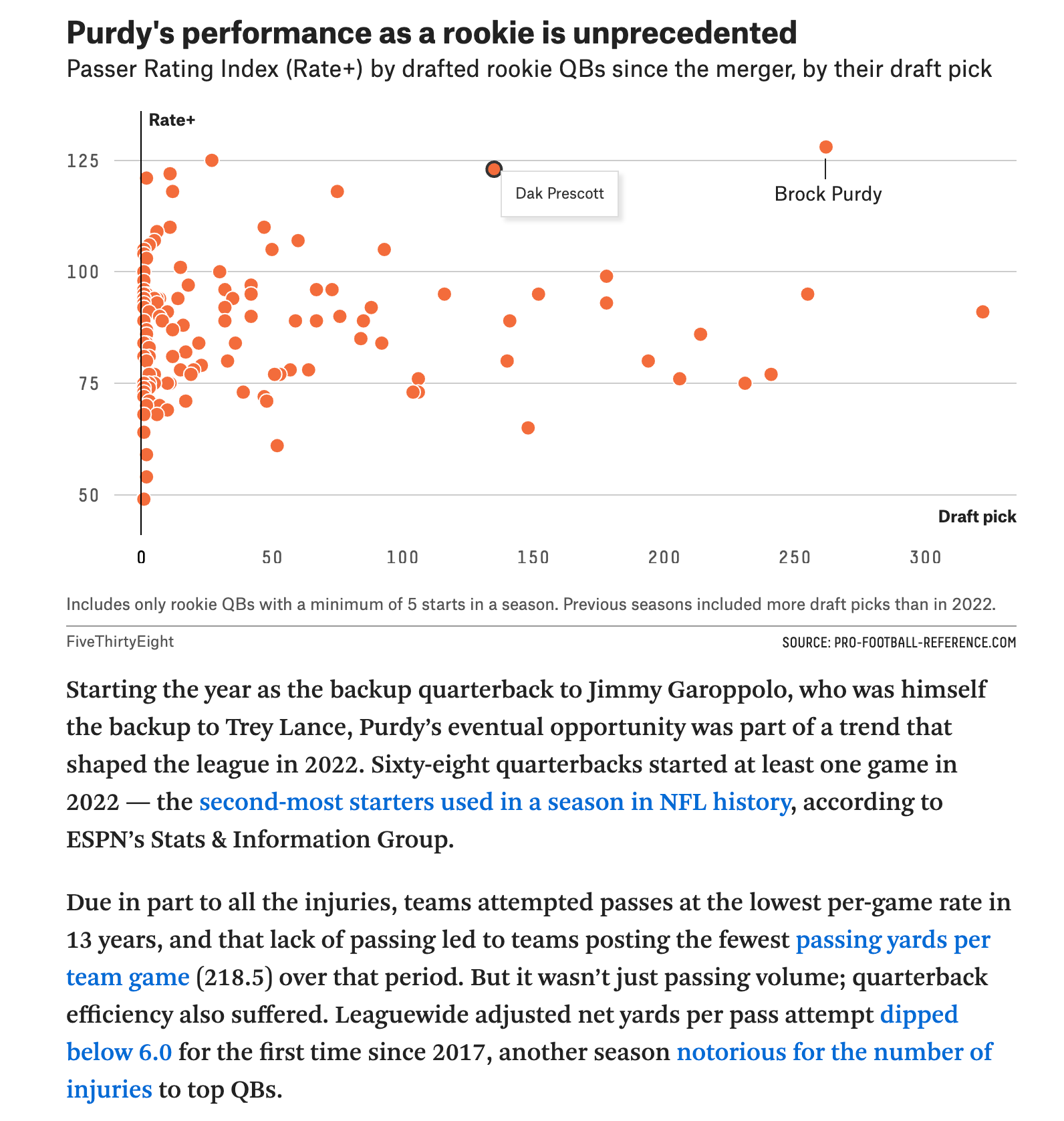
Getting Into the Flow: FiveThirtyEight
FiveThirtyEight, a data visualization blog that uses "data and evidence to advance the public knowledge — adding certainty where we can and uncertainty where we must," is one of my favorite websites for data driven storytelling. Formally under ESPN, FiveThirtyEight shifted under ABC News in 2018 who are both owned by The Walt Disney Company and focuses on politics, sports and science. I have been actively following FiveThirtyEight's sports articles that use compelling data to drive their points in articles, such as the image below in an article titled "Brock Purdy Was Mr. Irrelevant. Now He's Mr. Impossible."
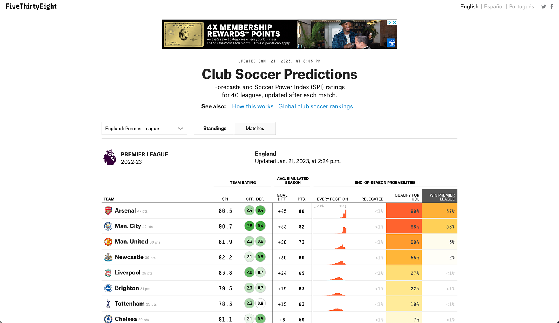
FiveThirtyEight also has an incredible sports predictions function on their website, one I have actively been following for several years now. Their website was one of the only to predict the Boston Celtics making the NBA Finals during the season last year, a prediction that went on to be accurate. The website makes the data and predictions easy to digest for readers, and offers links to how their predictions work for those interested in learning more. The image below is their current predictions for the 2022-23 Premier League standings.